

Data is complicated, but a visual can make it easier to understand. If you’re a small business or entrepreneur, having a graph or chart can help you land points with colleagues or investors. If you know how to turn your Google Forms results into a pie chart, you can dress up your survey or poll findings and really impress other stakeholders.
Google Forms offer a simple pie chart for personal use, but you can also create more in-depth and customizable pie charts in Google Sheets and use them in elaborate presentations.
In this tutorial, we'll show you how to turn your Google Forms results into a beautiful pie chart that you can download and share with your team. We'll also walk you through the benefits of using a Google Forms pie chart.
How to make and edit a pie chart in Google Docs
Step 1: Go to the Response tab of Google Form
After you create your form and send it out, the first thing you'll need to do is go to the "Responses" tab. It’s the second tab at the top of the form. This is where all of the form submissions are gathered.
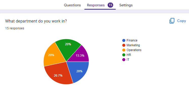
For certain questions, mainly multiple choice, a 2D Google Forms pie chart is automatically generated. If that’s good enough, you can copy it and you’re done.
However, if you’re interested in a better looking option, you’ll need to learn how to make and edit a pie chart in Google Sheets.
Step 2: Go to Google Sheet linked to Form
At the top-right of the "Responses" tab, you'll see the Google Sheets icon. Click this button to be taken to the Google Sheet that automatically collects your responses. This is how we will be creating, editing, and customizing a pie chart in Google Sheets.

Step 3: Create a pie chart on Google Sheets
In the Google Sheet, the first thing you'll need to do is highlight the cells that contain your form responses. To do this, click on the first cell and then drag your mouse until all of the cells are highlighted.
Once you've done this, go to “Insert,” and then “Chart” in the top menu bar. A new window will pop up with various chart options. For our purposes, we want to select "Pie chart" from the list of options.
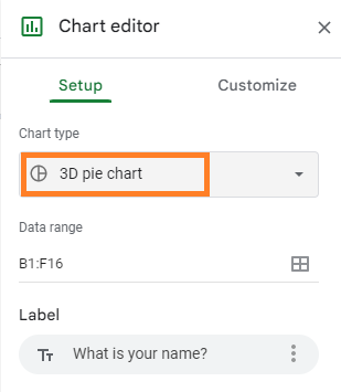
In the Setup tab, you can change the format of your pie chart. Your generated pie chart will probably have everything you’d like, but if anything is missing from the chart, or if you want to shift it around, this is where you’ll do it.
Step 4: How to customize and edit a pie chart on Google docs
After you've inserted the pie chart, there are tons of ways to customize it. Go to the Customize tab. There are several options, so we’ll go through each.
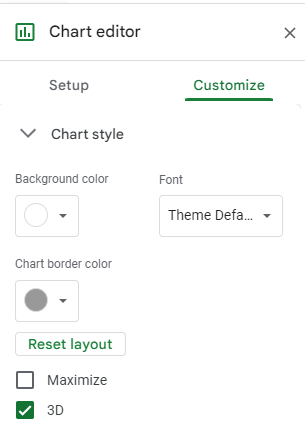
We’ll start with “Chart Style.” Here, you can change the background color, the font, and the border color around the chart. There are two checkboxes, too. The first is “Maximize.” This makes the pie chart a little bigger by removing blank border space. There’s also “3D,” which makes your pie chart pop out.
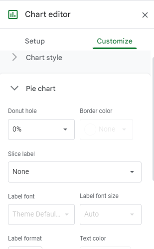
Next is “Pie chart.” This is where you can change the size of the hole in the middle, the border color of the chart itself, and the labels of each slice (including their font and color).
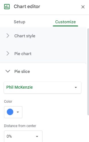
If you want to further customize the individual slices of your pie chart, you can do so by clicking on the "Pie slice" tab. This is where you can change the color of each slice, the distance of the slices from the center, and the title of each slice.
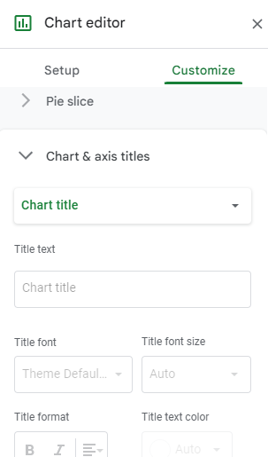
In the “Chart and axis titles” option, you can change up the title of the overall chart and change the labels of each axis. As you’d guess, you can change the text itself, the font, the format, and the text color. The drop-down at the top allows you to switch between the chart title and different axes.
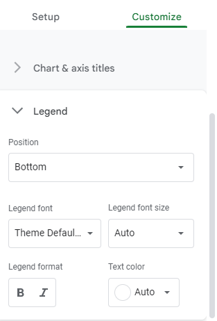
Finally, the "Legend" option allows you to change the position, font, and color of the legend. The position drop-down
Step 5: Download your Google Sheets pie chart
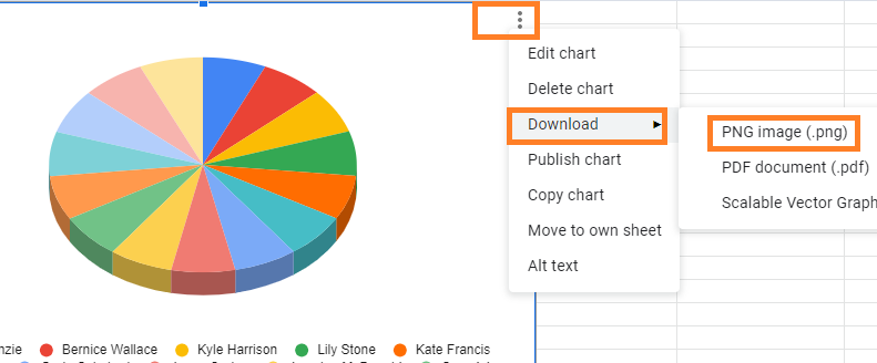
When you're happy with how your Google Docs pie chart looks, you can download it. Go to your chart and click on the three-dot icon in the top-right corner. Selecting “Download” will download your pie chart as a PNG file, which you can then insert into your document. You can also save it as a PDF.
So, there you have it! The perfect Google Form pie chart for your next presentation.
Benefits of creating a pie chart for Google Forms responses
Provides visual summary of responses from Google Forms
Pie charts are a great way to see which results are most common at a glance. This is because our brains are wired to process information visually. When we see a pie chart, we can quickly see which responses are most common and get a sense of the general trends.
This can be a helpful tool in understanding patterns and relationships between different data sets. Additionally, seeing the data visually can help you to remember it more easily.
In contrast, when looking at data in a table, it can be difficult to get an overview of what the numbers are saying. A pie chart solves this problem by condensing the information into a more digestible format.
See proportions of responses
In addition to providing a visual of the data, pie charts also make it easy to see proportions. This can help understand how different groups responded to a question or how different variables are related.
For example, if you want to see what percentage of people responded "Yes", "No", or "I don't know" to a question, a pie chart can make this information easy to digest.
Easier to observe certain question types
Some question types are easier to understand when presented in a pie chart such as multiple choice, linear scale, or checkbox questions. This is because each response option can be represented by its own slice of the pie. If you're trying to compare categorical data, a pie chart is usually the best option.
Make customizable pie charts in Google Forms with Advanced Summary
Now that you know how to make a circle graph in Google Sheets, you’re all set for stellar presentations.
It’s important to note that while there’s a lot involved in creating a pie chart in Google Sheets, these charts are a lot more customizable than native Google Forms charts. At the same time, you should know that there is a way to easily observe data and create charts in Google Forms itself. We're talking about the Advanced Summary add-on.
Advanced Summary is a Google Form add-on that allows you to take a deeper look at responses by adding filters to your forms. You can isolate certain variables—location, age, department—and view your responses through that lens. One of the biggest benefits is that you can customize the charts on your Google Forms rather than needing to use Google Sheets.With this, you can create beautiful pie charts right in Google Forms. Try out Advanced Summary today!